20% decrease in bounce rate, a 30% increase in session duration, and a 15% boost in online application conversions within the first three months
Project Overview
Client: American University of Iraq - Baghdad
Industry: Higher Education
Project Type: Website Redesign
Focus Areas: UX, Art Direction, Analytics
Challenge
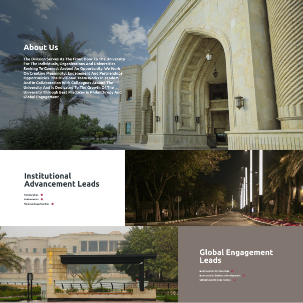
The American University of Iraq - Baghdad (AUIB) needed a redesigned website that would present a strong institutional brand while offering an intuitive user experience. The goal was to create a modern, user-friendly platform that conveys the university's vision of excellence in education and attracts prospective students, faculty, and partners. Key challenges included balancing the academic tone with accessibility, optimizing mobile experiences, and enhancing usability.
Art Direction
Brand Identity:
The art direction focused on reflecting AUIB’s prestige as a leading educational institution while making it approachable for international and local audiences.
Design Elements:
Color Palette:
The color scheme was inspired by AUIB’s brand, incorporating academic blues and whites, symbolizing trust, professionalism, and openness. A contrasting secondary palette of warm tones (oranges and yellows) was used to highlight important CTAs (Call to Actions) and events.Typography:
Clean, modern typefaces such as sans-serif fonts (e.g., Helvetica or Lato) were selected for headings and body text. These fonts provide legibility and professionalism, ideal for an academic environment.Imagery:
High-resolution photography of the campus, classrooms, and student life is prominently featured. The images are strategically placed to humanize the university and showcase its vibrant academic environment.
Visual Storytelling:
Visual elements, including a mix of photographs, icons, and infographics, were used to convey AUIB’s core values: academic excellence, innovation, and cultural heritage. The goal was to tell the story of AUIB’s diverse and inclusive community through engaging visuals that speak to both students and stakeholders.
User Experience (UX)
User Journey Mapping:
A comprehensive user journey map was developed, starting from prospective students visiting the homepage to exploring programs, admissions, and campus life. Key focus areas included ease of navigation and minimizing the number of steps needed to access important information.
Interactive Features:
Product Exploration:
For prospective students, an interactive program finder allows users to filter by degree, field of study, or department, enabling tailored exploration of available programs.Custom Navigation:
The website features an intuitive mega-menu for easy navigation across departments, student resources, admissions, and more. Quick access to important sections (e.g., Apply, Visit Campus) was prioritized through fixed navigation.Mobile Optimization:
The website is fully responsive, ensuring seamless access across devices. Layouts adjust fluidly to screen size, preserving readability and usability on smartphones and tablets.
Accessibility:
The website follows WCAG 2.1 guidelines to ensure accessibility for all users. Features such as screen reader compatibility, keyboard navigation, and high-contrast text options were integrated to accommodate users with disabilities.
Performance & Stats
Engagement Metrics:
Bounce Rate:
Initial analytics showed a decrease in bounce rate by 20% after the redesign due to improved content structure and navigation.Average Session Duration:
Users spent an average of 30% more time exploring academic programs and campus life pages, thanks to enhanced engagement tools.Conversion Rate:
The conversion rate for online applications increased by 15%, with more users completing the application process online.
Page Load Time:
Page load times were reduced by 40%, ensuring smooth and fast access to all content, especially on mobile devices.
User Feedback:
User surveys indicated high satisfaction with the overall navigation, the simplicity of finding information, and the website’s design. Both prospective students and current faculty noted the improved functionality and professional appearance.
Conclusion
The AUIB website redesign successfully balanced academic rigor with user-friendly design, effectively improving user engagement and conversion rates. The art direction aligned with AUIB’s mission, visually and functionally enhancing its digital presence. Analytics post-launch demonstrate improved performance across all key metrics, making the website a valuable tool in attracting and retaining students.
Visit the Website:
https://auib.edu.iq/


